In a nutshell
Answers to questions like: do we need to know how to code? What kind of Figma plugins should be used? Windows or macOS? And others.
Table of contents
- Do we write “UI/UX” or “UX/UI”?
- As a UX/UI Designer, do we need to know how to code?
- Is UX/UI Design art?
- Wireframes, UX or UI Designer's skill?
- What are the differences between low, medium and high fidelity prototypes?
- Why so many choices in UX/UI Design tools?
- Is the future of UX/UI Design tools the fusion of design and code?
- For or against the use of plugins on Figma?
- Should the UX/UI Designer write the texts of an application or a website?
- What is a “good” design in UX/UI?
- What about “ugly but useful”?
- Should you use native styles from Material Design or Apple HIG?
- Is Windows or macOS better for UX/UI Design?
- Are drawing skills required for UX/UI Design?
- Are user feedbacks always reliable?
- How to be creative in UX/UI Design?
- Are Dribbble shots good for UX/UI portfolios?
- Homemade or ready-made assets?
- How to practice UX/UI Design?
- Is it better to be a UX/UI Designer employee or freelance?
- UX/UI Designer, which complementary activity?
- As an UX/UI Designer, how much can I earn?
- Freelance contests, for or against?
- Fiverr, for or against?
Do we write “UI/UX” or “UX/UI”?
If you search for job postings, you can see that both forms are used. I personally prefer “UX/UI” because the UX comes first and then the UI afterwards. By writing “UX/UI”, it also shows that the UI is included in the UX, which is the case. I think the form “UI/UX” is also used, because it is “smoother” to pronounce (the “i” providing a better sound transition to “UX” than the “x” which cuts the sound).
As a UX/UI Designer, do we need to know how to code?
Big question, some will tell you no and some will say yes. My opinion is that it depends, but that in most cases, and unless you only work with iOS or Android developers, knowledge in HTML/CSS or even JS (frameworks like React or Vue) are welcome because you will most likely work with front-end developers.
Especially for a UI Designer (because closer to developers than the UX Designer), such knowledge is, in many cases, a real advantage when being hired. You’ll be able to better understand your front-end colleagues and even punctually integrate your own HTML/CSS mockups to help them, which is well seen in a startup (but I did say punctually, because if more than half of your time you’re developing, then you’ll have to review your job description 😉 ).
Is UX/UI Design art?
Question worthy of a philosophy exam, let’s say yes and no. That’s it, bam, give me an A+.
Ok, it depends, I’ll compare it to UI Design since UX is more “invisible”. Both have common points and differences, but if I had to summarize in one sentence:
Art transmits a message or raises questions, design brings solutions to usages. Both in a more or less aesthetic way.
For example the Mona Lisa and her subtle smile: what makes her smile? Or this abstract painting with a simple inkjet on a white background, what is its meaning? (If there is one 😉 ). Whereas a task management app, you don’t question it, you use it, even if the UI is top notch. Or a designer chair, like a work of art, it may be nice to look at but in the end it’s used to sit on, while the Mona Lisa isn’t (don’t try it you’ll get in trouble 😉 ).
Art can afford to be abstract and subjective, UI Design can’t. Art can remain aesthetic while UI Design has clients who have financial goals with the designed product.
However, in a mobile application for example, you can have illustrations, and there you can see the abstract and the subjective. But like UI Design, these illustrations have more restrictions in relation to the artist, such as budget constraints, respecting the image of the brand, illustrating a concept, etc.
We talked about what is produced (paint, application etc.) but these go hand in hand with the creator, and this is a crucial point. Because although both the artist and the UI Designer must be creative, in art, the artist expresses himself through his art. In UI Design, the beauty of the application serves to express the brand and the user experience. So as a UX/UI or UI Designer, you should not take yourself for an artist who wants to express himself too much through his UI Designs but “express himself” on behalf of the brand. Not always easy I agree to not get attached to his designs 😉 .
Wireframes, UX or UI Designer’s skill?
In theory, it’s more of a UX skill because we’re still defining the structure of an application than its visual aspect. That said, the border can be blurred depending on the level of detail of the wireframe, indeed, it can go from a simple block representing a whole form (“Blockframes”) to more precise details (“Wireframes”). For me, if a UX Designer and a UI Designer work on the same product, they can collaborate on the wireframes.
What are the differences between low, medium and high fidelity prototypes?
What I call a “low fidelity” prototype is a wireframe detailed enough to make it interactive, in order to test it with users. The “medium fidelity” prototype is the most known prototype, for example the one made on Figma from the final design. The “high fidelity” prototype is the one closest to or even identical to the final product, made for example with Protopie which allows to go further than Figma (and Sketch, Adobe XD etc.) by adding variable based logic, advanced animations, the use of phone’s sensors etc.
In general, we will be satisfied with a “medium fidelity” or simply “prototype” (we only specify the level if we also make a “high fidelity” for example). This is the most common in most companies, but depending on the product and the budget, the other two types have their uses.
Note: there can be several levels for a low fidelity prototype, for example, in some cases you might want to make interactive wireframes that were handmade on paper. To do this, simply import them into artboards, on Figma for example, and put transparent clickable areas over them to have a first usable prototype at a low cost.
Why so many choices in UX/UI Design tools?
If you take a look at UXTools, you’ll see that there is no lack of design tools. Among the UX/UI Design tools, which is your main one, there are really a lot of them, but only three are really on the podium. I can however give you a bunch of them: Framer, UXPin, Mockitt, Invision Studio, Lunacy, Proto.io, Justinmind, Mockflow, Mockplus, Moqups, Phase etc.
Several tools appear every year, and often, with a lot of good will to revolutionize UX/UI Design, for example with InVision Studio and its catchphrase: “The world’s most powerful screen design tool” and a lot of hype so that finally, almost nobody uses it… (9 people according to UXPin against 2147 for Figma). Another example with Phase with its headlines: “digital design reinvented”, but well, they’ve been in beta for a while and good luck to overtake Figma now…
Things are moving, relatively fast. Not so long ago, we still had to do UI Design on Photoshop, without being able to make a clickable prototype. Then with InVision it became easy but you had to import screens from Photoshop to InVision, not very practical… Then with the democratization of tools like Sketch and then Figma, Photoshop and InVision lost some space. I think that Figma has found its place as leader by replacing Sketch and will surely keep it for a while.
All this to say that you have to be wary of new tools, of course some of them can bring a real innovation, but you often have to be patient before seeing if it’s really worth spending full time on it. I talk about the criteria to choose in this article.
Is the future of UX/UI Design tools the fusion of design and code?
Originally, the worlds of design and code are quite separate, but more and more we are seeing a trend towards bringing them together. Framer, UXPin and other services such as the Anima plugin, are in the process of bringing together, almost merging, the worlds of design and development. The problem is that these two don’t always evolve at the same speed, it’s a bit like a long race between two runners: inevitably, their positions will often change, one will be in front and the next moment, the opposite. As a result, trying to “force” the two to be in rhythm can be harder to make it work than it seems.
Another problem with Framer and UXPin is their almost exclusive compatibility with React. So yes, it’s currently the most used JS framework (sorry, the “library” for the purists) in the world, but what if the company uses Vue or Angular for example? What if React loses popularity?
The future will tell us if Framer’s bet is winning, but in any case for the moment, the UXTools study shows us that they have not yet succeeded in imposing themselves.
However, there are other approaches like Storybook, which is more “cautious”. With their new plugin, they are moving towards a deeper integration with Figma so that we as designers don’t use code components in Figma, but rather control that the integration of our design are respected directly from there. Indeed, in an ideal world, for any modification of the UI, the designers first update the design in Figma, then the developers update the code. That said, it is rather rare that this good practice is respected 100% and with time, differences can appear between the developed components and their versions on Figma, often a collection of “small changes” that are made directly in the code and six months later, the developed product and the design are full of differences, and this poses a problem the day you need to design a major feature.
For or against the use of plugins on Figma?
At first sight, we could say that it’s a silly question, of course we should use them if it makes our work easier! Well, yes of course, but before installing a new plugin, there is a crucial condition to check: is it essential to modify the design or to make your prototype work?
Indeed, there are two types of plugins:
- Those that are useful for designing but are not essential once used.
- Those that add functionality to the software and are essential once used.
Let’s take concrete examples to understand: if we take the Icons8 plugin, it is very practical to find assets without leaving Figma. With it no problem, because once they are placed, you can even uninstall the plugin and still update your design. Or with the Stark plugin which serves, among other things, to check that the contrasts of your texts are accessible and if ever the plugin disappears, your design is still usable without problems, you just have to find a similar plugin.
Now take plugins like variables or Figmotion. The first one allows you to create variables and link them to any object property in Figma. The second one brings advanced animation tools directly into Figma. So yes of course, at first glance, we can say to ourselves that it’s great, these plugins increase the power of Figma tenfold, we might as well install as many as possible and become the best designer on earth (calm down 😉 ), but with this kind of plugins, I’m much more careful. Indeed, imagine you are a salaried designer and you produce the design of a complex application with the variables plugin. Everything is going well, you’ve synchronized with the developers to use the same variable names and they’ve even started writing the doc in that sense. Suddenly, after having done 80% of the work, the plugin doesn’t work anymore because you have used too many variables, and Figma starts to slow down, or even crash. So what do you do? You can’t just do without it since your whole process relies on it, so you try to see in the community if others have the same problem, and by chance, you find a forum with another designer who complains about the same problem, but no answer… You write to the plugin creator but he doesn’t know why this is happening and as this plugin is a personal project he has no commercial obligation to solve your problem. Now that your project deadline is fast approaching, good luck explaining to your superiors your mistake and that you have to spend more time than expected to undo this plugin and start again on a new base…
Note that for Figmotion it’s the same, if all your prototypes are based on it, the day there is a problem or the plugin disappears, what do you do with your designs that use it?
But be aware, this kind of plugins are not to be thrown away, on the contrary, but it is necessary to define in which context you use them. If it’s for a small personal project or in a company for a quick concept, why not. But you have to remember that: in a professional context, it is better that your designs do not depend on “amateur” plugins to be updated or to work. When I say amateur I’m not denigrating the work of the authors of these plugins, they are often well done, and that’s not the problem. No, the issue is that these plugins are often projects made for fun without necessarily a long term commercial vision, and that therefore, there is not necessarily support in case of bugs and especially, no guarantees that the plugin continues to be developed (especially if there is only one developer behind it).
On the contrary, if for example you choose to use Protopie’s variables and animation system, of course you have to use another tool, which you have to pay for, but you have the assurance that behind it, you will have a professional support (in addition to the community), that there are several employees working to improve their product, to correct bugs and that the tool will still be present in the years to come (at least of course, but it is already more likely than plugins).
So yes, sometimes a plugin can bring you a feature you really miss, but weigh the pros and cons carefully. If for example Figma integrates this feature six months later, it would have been better to wait. You can see here if your feature is in the Figma pipeline.
See my free book for my favorite plugins.
Should the UX/UI Designer write the texts of an application or a website?
It all depends on what we mean by “text”. If we are talking about labels of buttons or tabs for example, yes, this is what we call “UX microcopy”. However, for longer texts, generally no, because it is a separate skill that is rather for the marketing team or a specialized copywriter.
What is a “good” design in UX/UI?
There are two things to separate when judging a “good” design: usability and visual style. The first one is not subjective while the second one is. For example a stock management application could be simple and clear to use, with a logical structure between the screens of the application, a coherence between the components (e.g. no button of a different style from one screen to another), no accessibility problems, fast to launch and without bugs etc. But on the visual side, it could very well be of an outdated style with fluorescent gradients in the buttons and big borders, but is it a good design? Objectively: it is a good UX Design but subjectively for me: a less good UI Design.
What about “ugly but useful”?
Sure an UI can be “ugly” but as long as it is consistent (i.e., not 15 conflicting button styles), the UX stays afloat. That said, especially in competitive fields, your UI had better stand out visually as well, as this is something that users who are offered five similar applications will take into account. In short, the more competition the product has, the more the UI has to stand out.
Moreover, even on more specialized markets, we could for example talk about the Soyuz rocket’s cockpit, it’s really ugly but astronauts know how to use it and the layout of the elements is logical and well thought out. That said, when you see the SpaceX one, you are on another visual level of interface, proof that UI Design can also be important on niche markets.
Should you use native styles from Material Design or Apple HIG?
If we design a mobile application, there are two schools of thought, either follow these charts or make a custom design. Starting from their chart can be good to launch an application quickly at low cost and the familiarity of the design can reassure users, but at the same time your product will look like others and may have difficulty to stand out.
Is Windows or macOS better for UX/UI Design?
You probably already know this, but a majority of designers work on Apple machines. Historically, Macs have always been the machines for designers of all kinds. Windows, however, can be used for UX/UI Design without too many problems (unless you want to use Sketch which only works on macOS).
Anyway, the study by UXTools shows that Apple is still ahead. Personally, I prefer macOS for the following reasons:
- In general, design softwares are released first on macOS and after a while on Windows (Photoshop, Affinity Designer, Adobe XD, Protopie, etc.) when they are only on macOS (Sketch, Principle). One could therefore logically say that they are better optimized on macOS since that is where the majority of users of these programs are.
- macOS still has a better UX/UI than Windows 😉 (Even with Windows 11, there are still configuration screens that date back to the UI of Windows 7 and even before, for the sake of visual consistency…).
- The ecosystem: an iPad with the Apple Pencil in addition to a Mac is a real plus for creativity, an example among others: you make your UI sketches on GoodNotes and can find them synchronized on your Mac, same for Affinity Designer or Adobe Applications. Moreover, with Apple’s recent “Universal Control” technology, you can now control your iPad from a MacBook or iMac.
As a Windows equivalent to the Mac/iPad combo we could mention the Surface Pro but the price/power ratio is less compared to a MacBook Air M1 for example, however at least the Surface Pro is also a tablet.
Note: what about Linux (like Ubuntu)? For the UX/UI Design in the professional world, you can forget it… (Most of the design softwares used in the industry don’t work on it).
Are drawing skills required for UX/UI Design?
Not necessarily, but it depends on what we mean by “drawing”. For example, knowing how to do concept art won’t really help. However, some basics are still welcome, if for example you have to design icons or basic illustrations. Moreover, it will help you to be more efficient in UI sketches. Nothing prevents you from improving your skills in this area, but it’s like code, it’s not your core business and it’s better to call a professional illustrator if you have advanced needs.
Are user feedbacks always reliable?
Not always. For example Steve Jobs, with the first iPhone had complaints from users that the keyboard keys were too small for their fingers, to which he replied: “your thumbs will learn” (Business Insider), and they did. Sometimes users will tell you that they don’t like your design, but really, it’s because it takes them out of their comfort zones, but you know it’s for the better, so you can persist and be right in the long run.
How to be creative in UX/UI Design?
In his documentary Everything is a Remix, Kirbi Ferguson identifies three basic elements or steps that define creativity. They can be applied to any creative field, from writing to filmmaking and of course UX/UI Design.
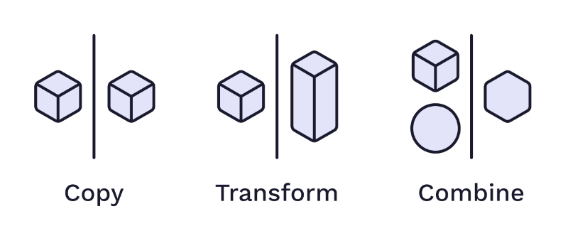
In a good design, there are elements of other designs, which, combined and transformed according to the designer’s personality, result in something new (which will then be taken up by other designers, etc.). Hence the importance of inspiration in the creative process. As Pablo Picasso said:
“Good artists copy, great artists steal.”
But of course, it’s not about stealing by copying 100% of a design and saying it’s yours. I recommend checking out these resources on creativity, which are easily transferable to any creative field:
Everything is a remix: a very well-done documentary on the subject with many examples in many creative fields. Star Wars is for example deconstructed by citing the main inspirations used by George Lucas and his team.
The Habits of Effective Artists: conference by a 3D designer on 7 important points of creativity that he learned during a challenge on how to draw.
Steal Like an Artist: a classic book on why “stealing” is important to an artist and why it’s not stealing if it’s done right.
Are Dribbble shots good for UX/UI portfolios?
Practicing UX/UI Design by only designing fractions of an app and putting the emphasis on visual wow effects is clearly not a good idea. Dribbble is often criticized, like Instagram for that matter, for being a race to see who gets the most likes on designs that don’t take into account the overall UX of the product.
Take this design, as there are many:
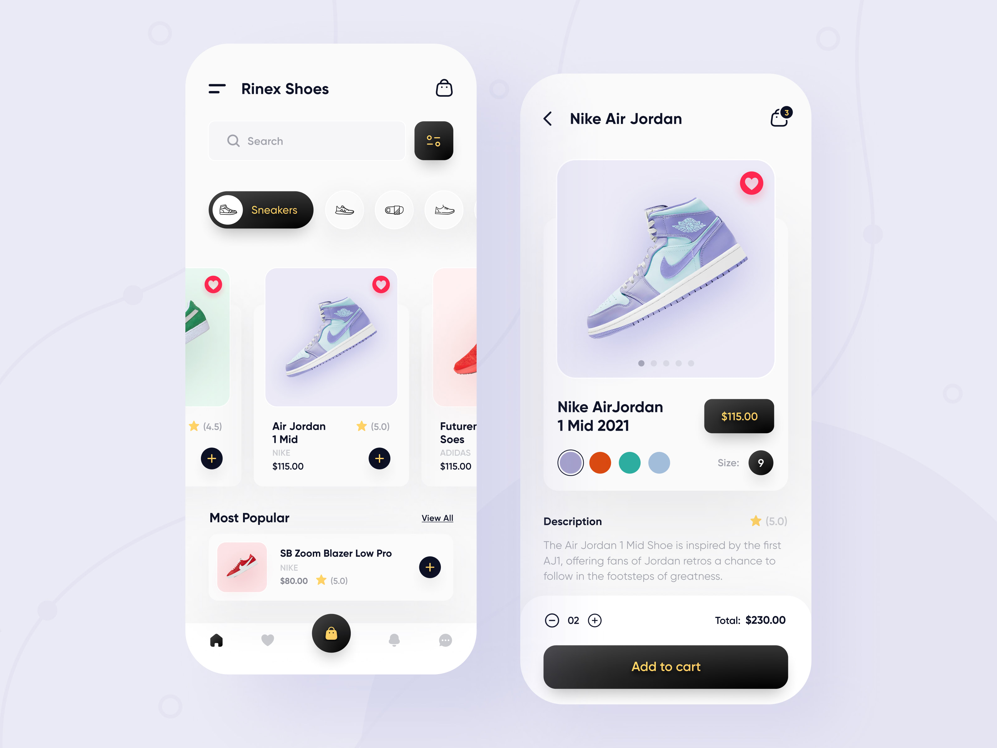
Sure at first glance, it looks nice, but in terms of UX and even UI, there are a lot of open questions:
- What’s the difference between the bottom button and the top right button that have the same shopping cart icon?
- How do I access my account? Or maybe there isn’t one but then how do I find my orders?
- How do the search function, the filter button next to it, and the tabs below it (“Sneakers etc.”) interact? Are there no confusion in terms of UX?
- The animation of the shoes when scrolling is nice (see original post) but it could be expensive (each model has to be cut out and the developers have to code the animations, all this takes time and therefore money).
- On the product screen, what does the size selector look like? And how do we manage the different size conventions depending on the country?
- How do we fit on the product screen if there are more than six colors to choose from? Do we put a slider?
- What does the UI look like in dark theme? How is the style declined on other screens? Etc.
But careful, I’m not saying that this particular design is not good because of these issues, that’s not its purpose. Dribbble shots are not useless, on the contrary, I advise doing them because it makes you practice UI Design (choosing colors, spaces, icons, staying visually coherent, etc.) as well as exploring new styles.
The important point to remember is that a portfolio filled only with Dribbble shots doesn’t make a good UX/UI Design portfolio, you mustn’t neglect the practice on more complete projects, certainly longer but crucial to perfect your UX skills. An application is a whole and the different screens often influence each other.
Homemade or ready-made assets?
As a UX/UI Designer, you don’t have to do everything, i.e. be an iconographer, typographer, illustrator, photographer, motion designer, etc. But to know which assets to use and where to find them.
We could also see the UX/UI Designer as a composer who composes digital applications with visual elements. That said, it is always appreciated for example, to know how to make some custom icons.
There are many good sources for ready-made assets, for free or at a good price, you have for example Envato Elements (premium) or Icons8 (free). You can get more resources from my free book.
Most of the time, however, for large projects (with a budget) that often need custom assets like illustrations, the company will call upon a professional illustrator.
How to practice UX/UI Design?
If you are starting, be sure to have the basics knowledge of your main tool, like Figma (resources to learn it).
Here is a progressive list of practices that I recommend to start and get better at UX/UI Design:
1 - Copy or “studies”
The first step when beginning is to “simply” copy other designs. For that, just copy images of designs you like on your design tool, and simply copy them by recreating them alongside. You don’t necessarily have to copy all the screens of an application though, you can take images from Dribbble and from applications you use for example.
This practice might seem like a waste of time because we tend to feel the need to make our own creations quickly, but not at all. Indeed, we learn handwriting by copying templates that are well done, a musical instrument by performing songs, drawing from templates, cycling by copying Lance Armstrong (drugs are bad), well you get the idea 😉 . By doing this, you integrate different design styles much more effectively than by looking at them, it sharpens your observation skills and finally, it makes you better at mastering your tool.
It goes without saying that these studies should not go into your portfolio.
2 - Mixing
Once you have copied some designs and when you feel like it, you can start making your own ones by combining two or more designs together, for example, you can mix the idea of one application with the style of another.
3- Improve existing products
For example, you can go to Android and iOS stores to find apps that would have an average design and try to improve them, it can give a boost to the visibility of your portfolio when you start and don’t have any professional project to put on it yet. In the same way, you can redesign well-known products like Google, Twitter, etc.
4 - Practice with briefs
There are sites like dailyui.co that will send you every day for 100 days, a design topic to create, like a login screen or a contact page.
In parallel or after, a good idea to get a start in the professional world is to practice with fake briefs with Fake Clients or Good Brief. For reals one, you have for example Dribbble Freelance Jobs or Upwork, but unfortunately, you don’t always have the details of the mission.
You also have the Dribbble Weekly Warm-up (top left on “Inspiration”) to participate in challenges, but it’s not only about UX/UI Design. There is also the Behance Creative Challenge but it’s focused on Adobe XD.
Beware of freelance challenges where the client makes many designers work on the same brief and in the end, only one designer gets paid. I talk more about this topic here: Freelance contests, for or against?.
5 - Create your designs
Although this is the last step, it doesn’t mean you have to do all the others first, but it is recommended. Indeed, if done seriously, they will give you a good basis for ideas and which styles to use.
I refer you to my article UX/UI Design process with an example, where as I recall, everything starts from an idea, a vision.
Be careful with the dosage
As I explained in this previous question, only doing Dribbble shots is not recommended, you have to balance your practice between quick explorations and more complete projects like the whole design of a rollerblade reservation application or an action as a whole, like the purchase path on a website specialized in Icelandic yogurts (yep, they are the best 😎 ).
To summarize, designing only the part of an application (for example the login/signup one) or even trying several styles with the same content, is UI Design. Making several sketches or wireframes on how to solve the same problem (e.g. organizing your daily tasks in an optimal way) is UX Design. And finally, designing an application from the structure to the final prototype is UX/UI Design.
Is it better to be a UX/UI Designer employee or freelance?
Often the first question that people ask themselves, these are two different worlds. My advice would be if you are starting out, to begin as a salaried employee to get some experience, and after a few years, if you are tempted by the freelance mode, you can for example mix a part-time salaried position with freelancing (I don’t recommend combining it with a full-time job, as it is difficult to keep it up over the long term, unless it is a one-off).
A popular freelancing platform is Upwork, and very quickly, you will see that the competition is tough. Not to mention that in an open digital world, you can find yourself competing with designers from all over the world who don’t have the same requirements in terms of remuneration. So, to break through, it’s better to have a good network, an rock-solid portfolio and continuous improvement be your main motive 😉 .
Employee in an agency or in a company?
As an employee, you have two main options, either in a company where you will work on one or more related products, for example a startup that would make a project management application. Or in an agency where you will work on projects for various clients.
Each one has its advantages and disadvantages, in a company you will have the opportunity to have a more significant impact on the product and to participate on the long term to its evolution, and if in addition you are passionate about the solution of your company, your motivation will be increased. On the other hand, always working on the same theme may prevent you from testing other design styles or being in contact with other types of users.
In an agency, you could say that the positives and negatives of the company are reversed. This is because in an agency, you will be able to explore multiple visual styles, but on the other hand, you may be frustrated by not being involved in the products you prefer in the long run. Another disadvantage of the agency is the schedules that depending on the clients may give you very busy weeks (forget the traditional 9 to 5 schedule 😉 ) and other times, the opposite. It’s up to you.
UX/UI Designer, which complementary activity?
In addition to your activity as an employee or freelancer, there is another way to earn money with your skills: the creation of assets on marketplaces. Among the most famous you have: Creative Market, Envato and Dribbble Marketplace where you can post many types of assets and get paid when people buy them, a kind of passive freelancing in short.
As an UX/UI Designer, how much can I earn?
It’s of course difficult to answer this question precisely, it will depend on your experience, status, startup or not, your tasks, seniority, the city, etc.
Here are two good resources to get an up-to-date average of UX/UI Designers salaries and be able to negotiate:
Freelance contests, for or against?
There is a subject that will make any serious freelancer’s hair stand on end: design contests like the ones where many designers work, but only one gets paid because “it will give you visibility!”. No freelancer who wants to earn a decent living will base his work on this kind of contest.
So you can say to yourself that it’s perfect to start in the business, it will make you practice on “real” projects that you will be able to put in your portfolio and sometimes even earn money! In a way it’s not wrong but it’s participating to their development and most of all, it’s shooting yourself in the foot if you want to be a freelance. Indeed, why would a client pay you if you’ve already done a lot of free designs?
But be aware, not all contests are without interest, for example, a non profit beach cleaning association could make one without paying the winner (no jealousy like that) or by offering a small gift to the first three (a one day surfing course on a clean beach for example 🏄 ). It gets the newbies practicing on a nice project and it’s more moral than the contest of the company that can afford to hire a freelancer and will make money off your design.
Generally speaking, any contest that isn’t a way for a lucrative company to bypass the services of a freelancer can be valid.
(Well fortunately, I feel like the subject has changed for the better in the last few years, at least I don’t hear as much about them as I used to, but they still exist).
Fiverr, for or against?
In the continuity of freelance competitions, you have Fiverr which is another well-known freelancing platform. But, unlike Malt and Upwork, where freelancers post their daily or hourly rate to define the price of a design according to the project, on Fiverr it’s the opposite, we start with a fixed price for a defined product, example: 12 screen designs for a mobile app for $150 (premium pack).
So in theory, Fiverr’s approach may seem more practical, but in reality, it can be a trap. Indeed, on these so called 12 screens, the customer can ask for really difficult designs (3D animated for example), good luck to tell him no. And if the customer asks for 14? What if they want a responsive design on a tablet? What if they already have a design they want to update? What if they want us to do a search first (moodboard type)? Etc.
A serious freelancer who wants to perpetuate his career should rather favor the Malt and Upwork approach, to give priority to quality projects where you can really accompany your client throughout the process and offer him a quote really adapted to his project.
However, this does not prevent you from also making all-in-one packs, for certain targeted and precise needs. Example: a set of 10 monochrome SVG icons, showing examples of the complexity not to be exceeded (because well, if the customer asks for a 3D illustration and calls it an icon… 😉 ).

Doko Zero
UI Designer with UX and web development skills