Table of contents
Proposal
oklch(gamut L RC H)gamut can either be srgb, display-p3 or p3 (same), and rec2020.
Exemple: oklch(p3 80% 100% 20) which means: “for a lightness of 80 % and a hue of 20, I want a color with the maximum chroma possible in the P3 gamut” and translate to oklch(80% 0.148 20).
This is a work in progress that might change in the future.
There is a discussion in csswg-drafts repo.
To see relative chroma in action visually, you can use the OkColor Figma plugin.
Motivation
OkLCH model only offers absolute chroma like 0.21, problem is, with oklch() in CSS, it’s easy to go out of gamut.
From there, currently, browsers will clip the individual RGB values of the requested color, which is not ideal because the resulting color will have a lightness and hue shift, more or less important depending on the chroma value.
For example, oklch(80% 0.37 20) is out of gamut but we don’t know that just by reading the color code.
In that case, for a P3 display, the resulting color in browsers will be oklch(65.71% 0.2963 14.53), but we might still think that we get a color with a lightness of 80 % and a hue of 20 because in the code, we only have oklch(80% 0.37 20) displayed.
Check this demo for more examples: OkLCH gamut clipping tests.
Wouldn’t it be great if from oklch(), we could somehow say: “for a lightness of 80 % and a hue of 20, I want a color with the maximum chroma possible in the P3 gamut”.
In details
From the current oklch() notation, the idea is to add support for a relative chroma value like this oklch(p3 80% 100% 20). This is similar to color(gamut c1 c2 c3) notation used to define RGB colors in relation to a gamut value (MDN doc).
But why not simply oklch(80% 100% 20)? In that case, we are missing something, indeed, with an absolute chroma value like 0.24, we don’t need to specify in which gamut we want to be, but with a relative value, yes.
In fact, with models like hsl() or rgb(), we also have relative values, but we can’t specify to which gamut they are relative, that’s because with them, in a CSS context, they are always relative to the sRGB gamut.
So, with oklch(80% 100% 20), to which gamut is 100 % relative to? We need this information to get the right absolute chroma value.
RGB color() notation already solves this, by having a gamut property (well, a colorspace one in fact, but here they are synonyms and in our case, gamut is more precise).
So the idea is to have the same here, which gives us the following syntax:
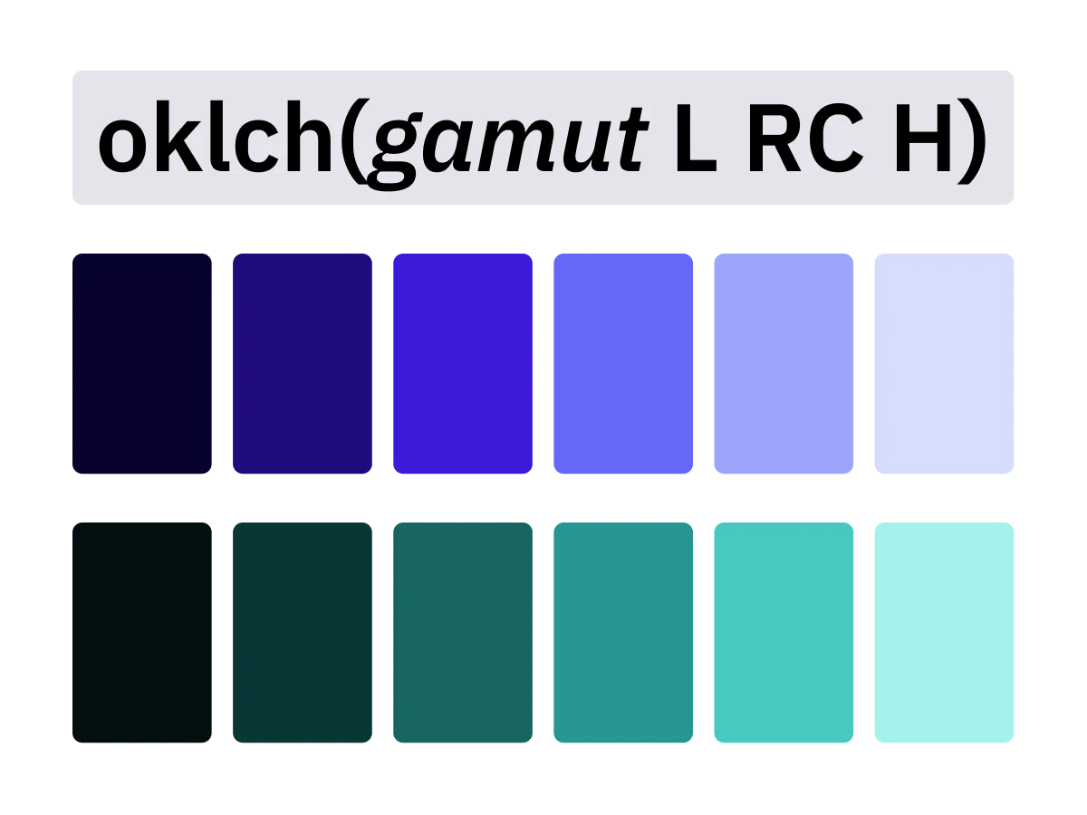
oklch(gamut L RC H)gamut can either be srgb, display-p3 or p3 (same), and rec2020 (and more in theory, but for now, the PostCSS plugin supports these only).
With this upgraded notation, we easily stay within the gamut bounds we want to work in.
We can think of it as an improved HSL color space, which is uniform and allows us to pick colors in larger color gamuts than sRGB.
From there, oklch(p3 80% 100% 20) has to be read as: “for a lightness of 80 % and a hue of 20, I want a color with the maximum chroma possible in the P3 gamut”, which gives us oklch(80% 0.148 20).
Another example, oklch(srgb 40% 80% 140) has to be read as: “for a lightness of 40 % and a hue of 140, I want a color with 80 % of the maximum chroma possible in the sRGB gamut”, which gives us oklch(40% 0.103 140).
Note that currently, natively in CSS, we can use oklch(80% 100% 20) for example, but here 100 % always means 0.4 (source) which is not useful for our purpose, as the value is always relative to 0.4 and not the bounds of the gamut we want to work with.
Use cases
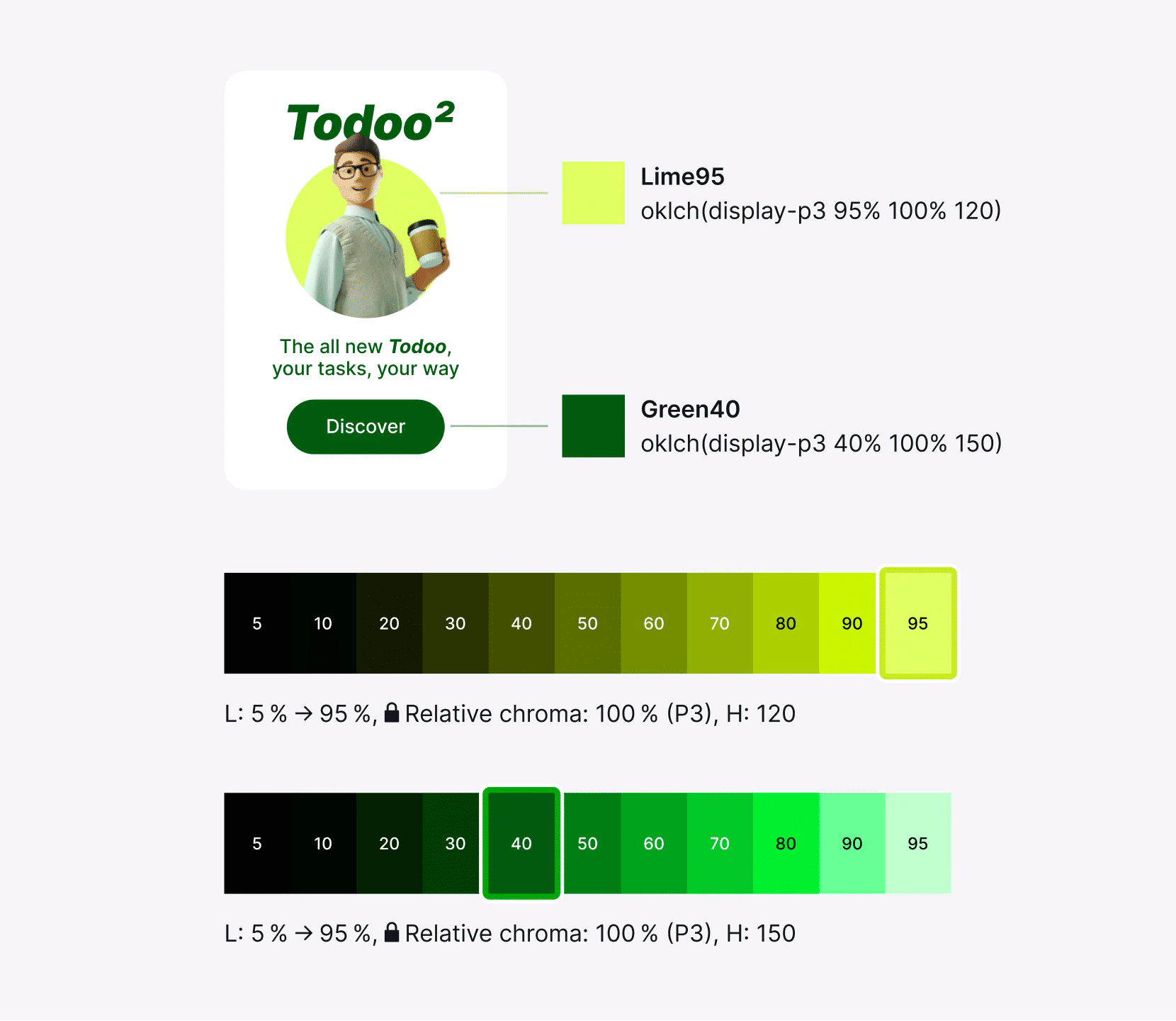
With this new feature, we can now easily create lightness variants on the fly, which are uniform and consistent, without leaving CSS.
For example, if we start from a base color of oklch(p3 50% 100% 135), we just have to change the lightness value, and the model will automatically get the right absolute chroma behind, without the need to manually define it ourselves.
From there, we can easily create a color palette by going from oklch(p3 5% 100% 135) to oklch(p3 95% 100% 135) using lightness steps of 10 %, or another value.
Here is a visualization in Figma with OkColor plugin:
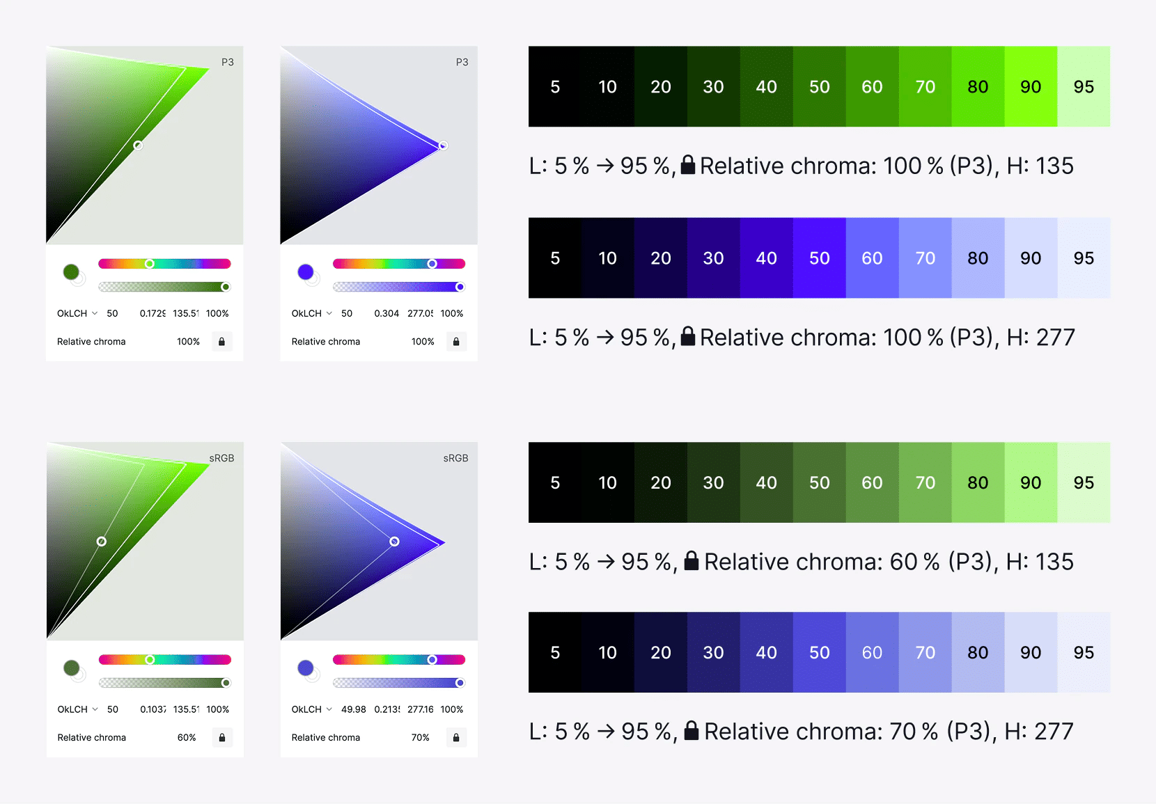
If we tried to use the same absolute chroma value for all lightness variants, we would get palettes that are not uniform with unwanted lightness and hue shifting:

For more examples of this, you can check the demo which has more palettes with fixed absolute chroma values.
Note that even if we clip only the chroma, using a fixed relative chroma for the palette is better because with a fixed absolute chroma, some lightness variants would have the same chroma value and some different ones, which leads to inconsistent palettes.
Now for some practical examples, we can then easily create lightness variants on the fly as needed:
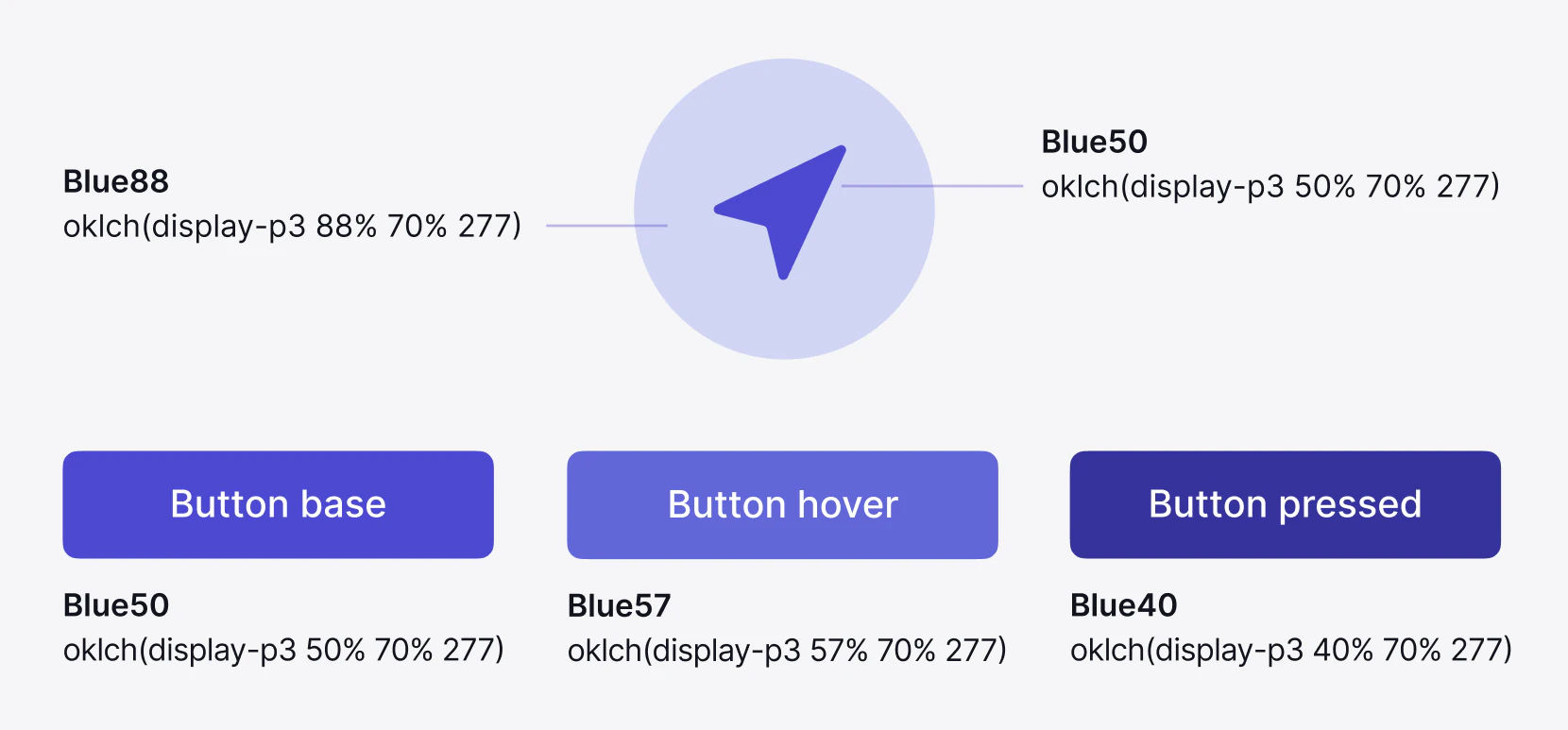
Of course, here we could still use the same absolute chroma value for the variants, but for consistency sake and depending on the color we start from, we could be out of gamut and have unwanted lightness and hue shifts.
How to make all palettes blend smoothly?
You can see from the demo that some palettes don’t blend perfectly together.
For some, there are one or two lightness variants that seem to be a bit too vivid compared to the others. This is mostly the case in P3 and when the relative chroma is around 90-100 %.
However, this is because we see it in relation to all the other lightness variants in the palette, but in practice, when designing, the users never see the palettes like this, and is less of a problem.
You can see it with OkColor plugin or with oklch.com, this is because for some hues like yellow or cyan, their peak chroma (peak of the triangle) is close to white.
This leads to a larger gap between the absolute chroma values between the lightness variants around this peak.
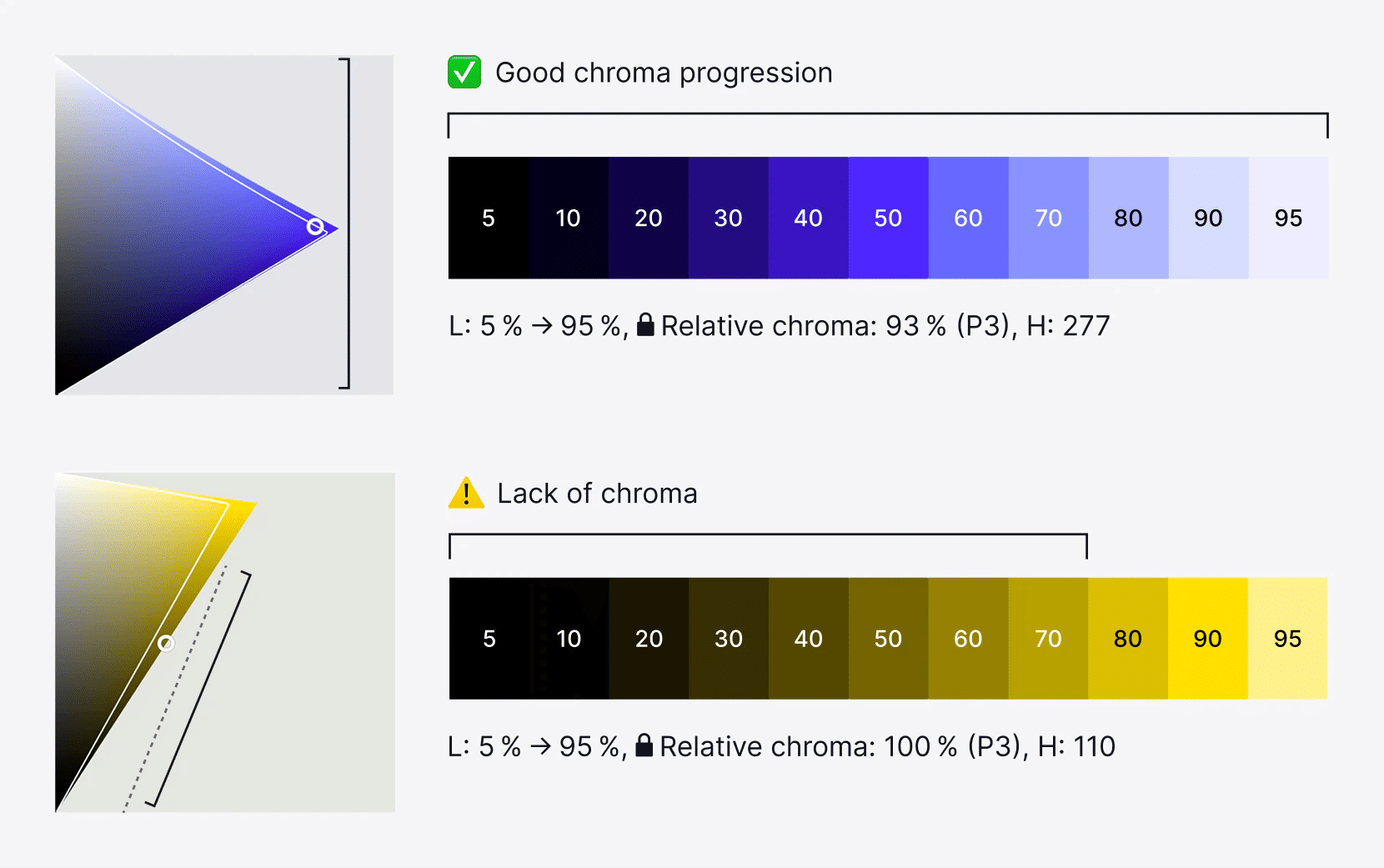
Also, some palettes like the yellow one lack chroma in the dark variants.
This is not a bug from OkLCH but a limitation of our screens and human vision. Compared for example to a blue hue, you can see with OkColor this lack of chroma for the yellow hue:
The solution here is to manually shift the hue of the palette lightness variants by a fixed step:

So, in the case we need to create complete palettes that look good together before designing, we can make some manual adjustments. That’s what I did for the third palette in the demo.
But if we don’t need to create complete palettes beforehand, a simpler approach is to use lightness variants from two palettes.
For example, the lime palette below could benefit from a hue shift in the dark variants toward green hue, but in practice and if we create lightness variants on the fly, we can simply use two palettes: